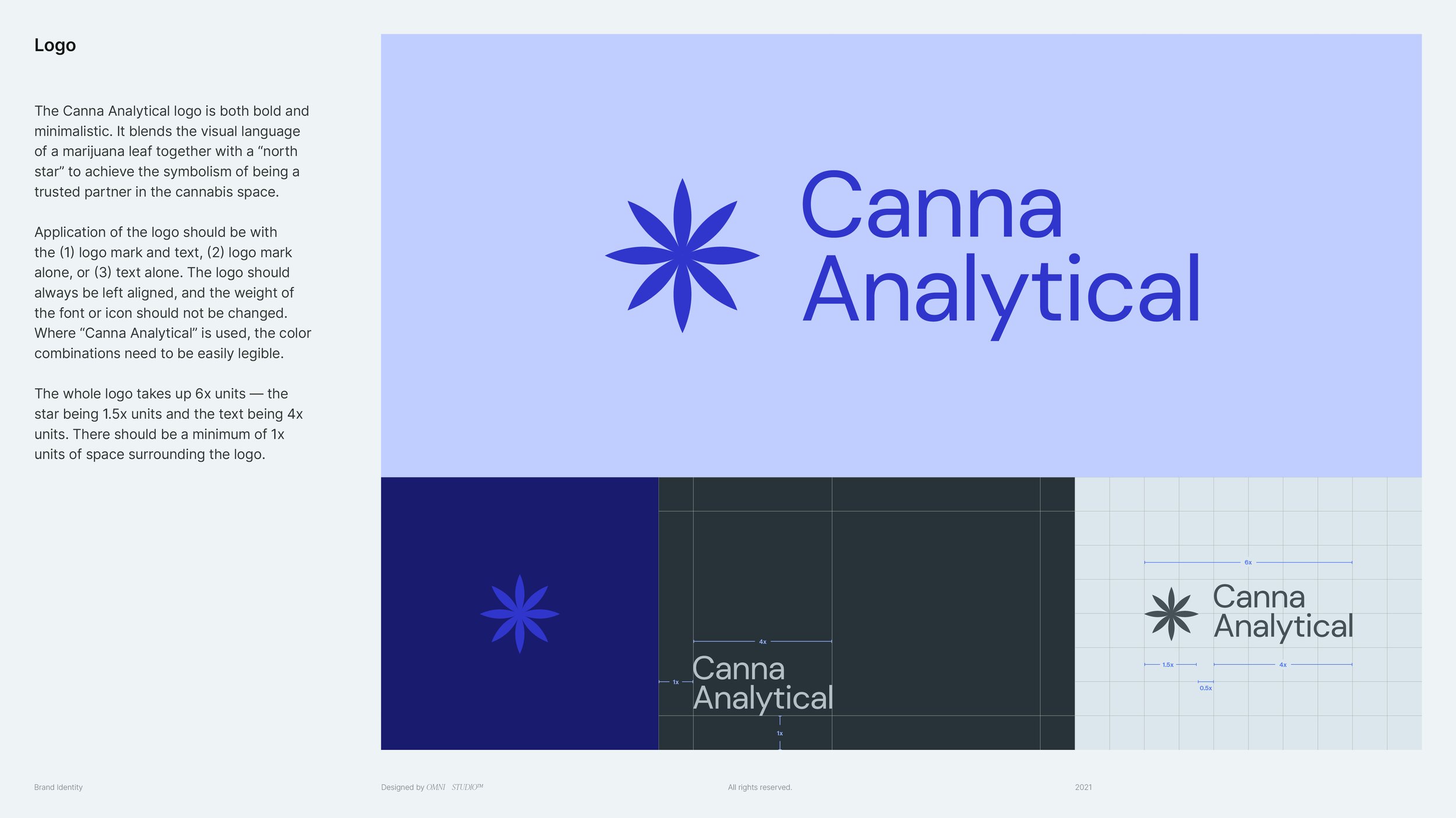
Visual identity centered around trust for a scientific testing laboratory
Canna Analytical is a scientific testing company whose mission is be the north star for modern, market-leading, and reliable cannabis lab testing.
Given that the cannabis industry still faces apprehension within the scientific and legal community, Canna Analytical was born as a spin-off from their parent company MAI, as an attempt to maintain distance from any taboo while still leveraging the infrastructure and experience of a larger company. While their desire was to create something separate from MAI’s current traditional brand language, they still wanted to emulate the same sense of “highly skilled scientists with a security-first approach” as their parent company.
The ask was to build a modern, welcoming, and scientific brand language that was simple and malleable enough to grow over time as they continued to refine their offerings. Their target audience of clients who need testing services are: distributors, manufacturers, R&D, and cultivation farms. It was important to not only create a design language that was distinct and modern compared to MAI, but to also tap into the culture of their clients to evoke trust and familiarity.
2021
Client
Canna Analytical
Industry
Science
Brand Guidelines


The best brands are the ones with the most consistency. A comprehensive package was created to ensure Canna Analytical’s brand consistency was easy to follow regardless of the audience (new employees, PR, consultancies, etc.).
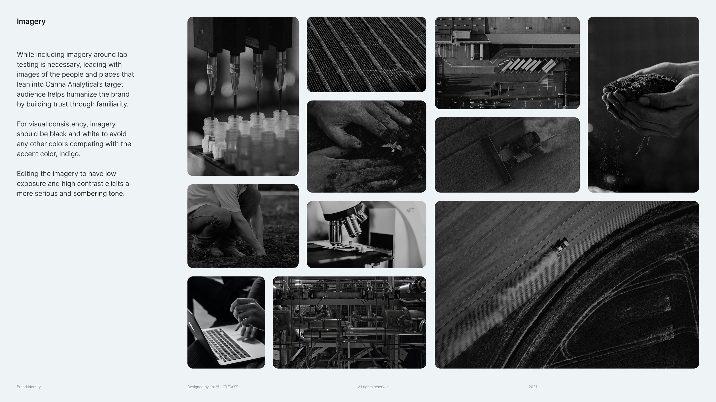
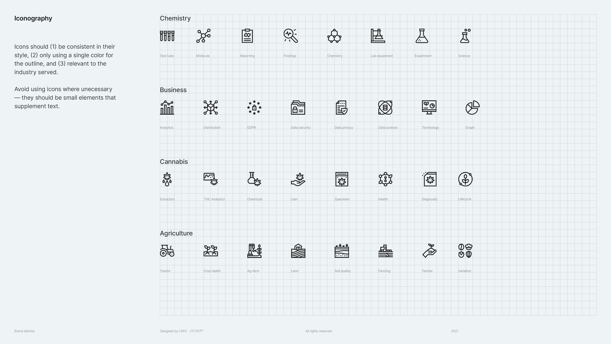
In addition to technical aspects like logo specs and hex codes, we also included font choices, imagery, product marketing content, and iconography to more holistically emulate the brand message.
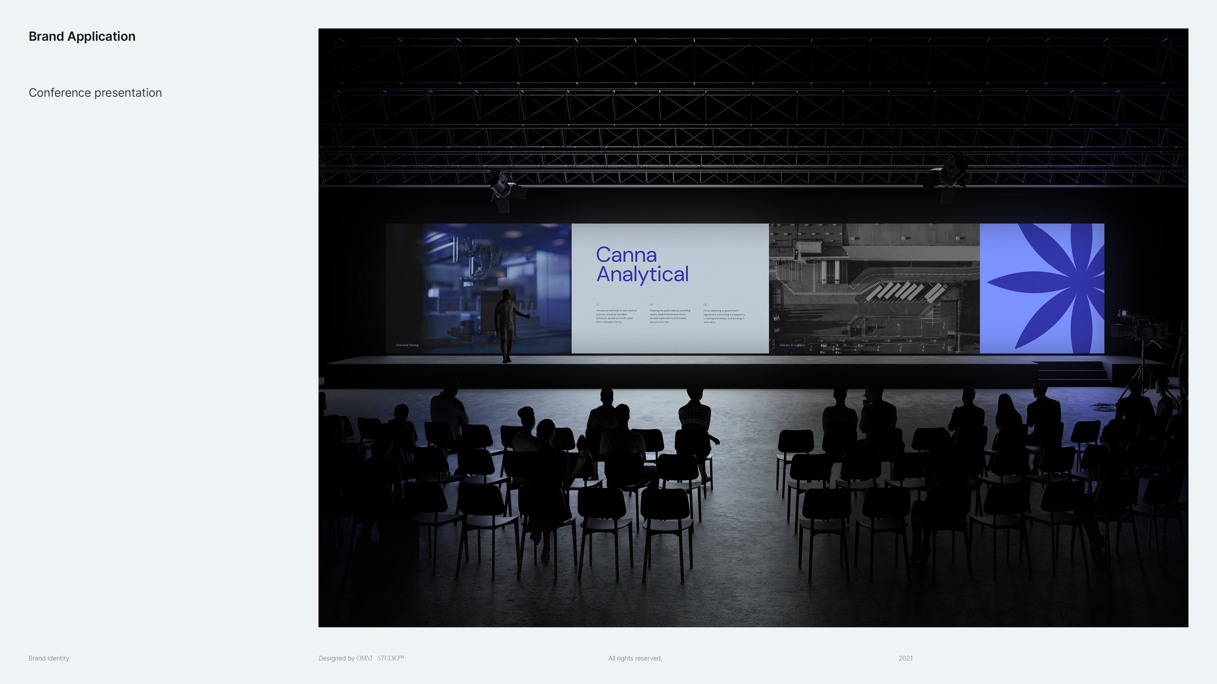
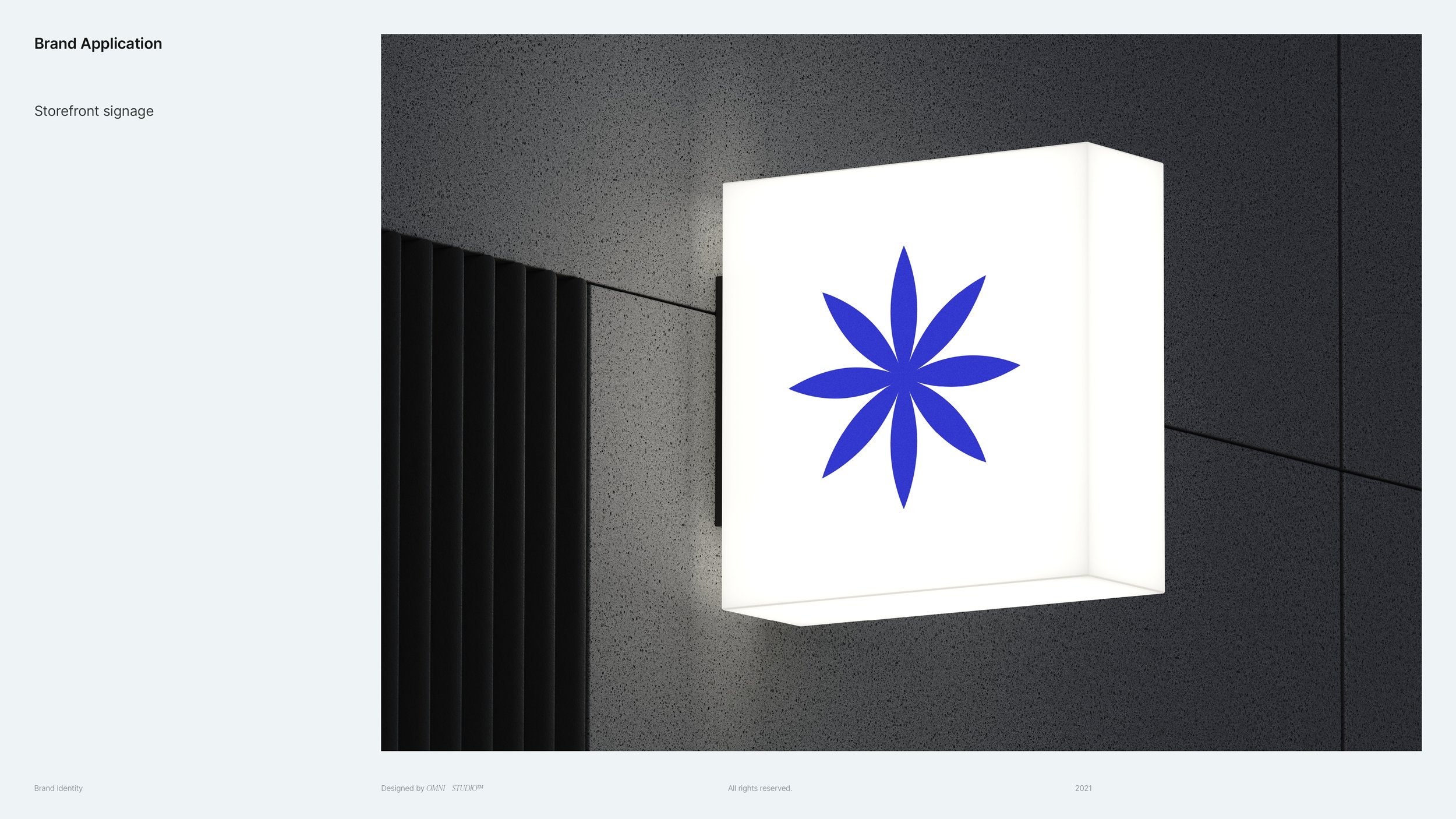
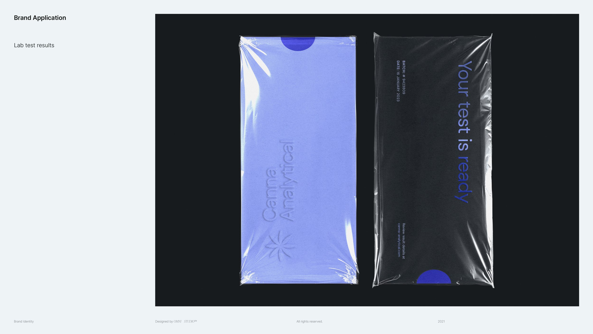
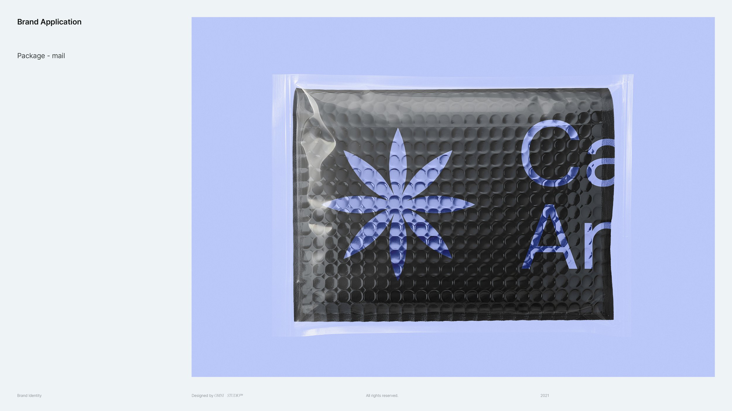
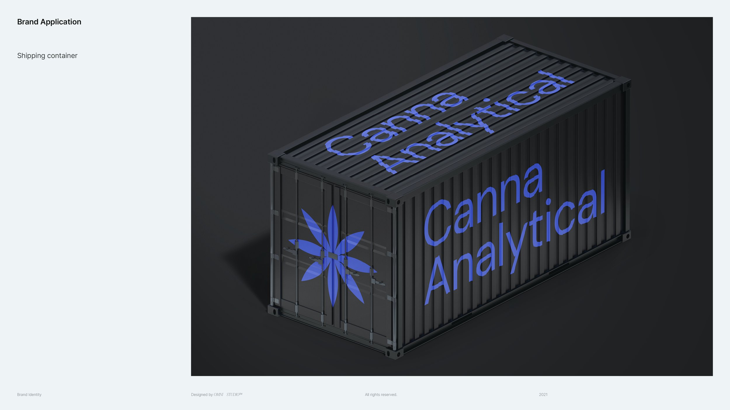
Brand Application


